Which is your favourite color? Why do you prefer it? Does it bring back precious childhood memories or any other reason? Colors can help you feel better, they influence your decision-making and much more. Read my blog post to see how you can use them mindfully, for your betterment.
I’m a blogger who shares a variety of tips to make your daily life easier. In this blog post, I’m sharing how you can use hues favourably.
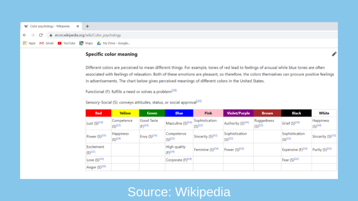
The ideas I’m giving below in this post are based on a chart from Wikipedia, showing ‘perceived meanings of colors in the United States’. So, let’s dive into it.
Red
Red attracts attention. It’s seen as lust, power, excitement, love, and anger. To the ladies who are reading my blog, do wear it when you plan to shine out at parties or impress a special date (outside of the lockdown period, at the time of updating this blog post, for social distancing needs)!
Yellow
I wonder how many people love yellow. However, it’s seen as competence and happiness. Want to feel warm and joyful? Use yellow curtains.
Green
Green for good taste and envy. Do you love trees, greenery, and nature? I sure do. It’s calm and serene.
Blue
Blue is popular and seen as masculine, competent, high quality and corporate. It reminds me of a clear sky, lovely beaches, and tropical destinations.
“Blue is the color of peace. Water is blue. I like the color blue because it just puts me at peace. The patriotic symbol is blue. I just like blue.” – Antonio Brown

A screenshot from Wikipedia with the details:
Pink
Sophistication, sincerity, and feminine. Many ladylike brands prefer pinkish tints. How would you use it?
Violet/Purple
Purple depicts authority, sophistication, and power. It reminds me of jacaranda flowers in my garden.
Brown
In the Wikipedia article that I’m referring to, brown shows ruggedness. I’m personally thinking of chocolate right now and would love to relish some… What about you?
Black
Black is often perceived as grief, sophistication, expensive and fear. In countries with hot climates, wearing black would make you feel stuffy. Whereas in cold places, I think black overcoats are cozy.
White
White is described as happiness, sincerity, and purity. I prefer reading text on a white background. It makes it clutter-free, so I can stay focused and be productive with work.
After having an idea of how colors are generally perceived in the United States (this varies from person to person, life experience, culture, and more factors), use them to your advantage. Be mindful of which ones you choose or avoid. Ensure that your favourites are present at strategic places. For example, have you got a dream board to achieve your set goals? Use them there.
Conclusion
Be mindful, go for the right colors that enhance your mood, keep you motivated, are conducive to your holistic wellness and success. Do you have any tips to share? Please do so. If you know anyone who would benefit from my blog post, please share it. Thank you!!
Editor’s Note: This blog post has been edited and updated for better accuracy and comprehensiveness.
Featured photo: Photo by Sharon McCutcheon on Pexels.com


My favorite color is yellow. I am looking forward to the daffodils which will soon be blooming here in KY
LikeLiked by 1 person
Lovely! Have a great weekend.
LikeLike
Interesting thoughts about colors and what they might mean in different climates and cultures. I didn’t realize that the color black was perceived as expensive.
LikeLiked by 1 person
Thanks for stopping by, Autumn!
LikeLike
Glad to know all of these, in some cases, colors represent our attitudes and moods.
LikeLiked by 1 person
You’re so right. Thanks for your comment!
LikeLike
This is a great read. I just like colors without knowing their significances. I do not think I have any favorite colors but I do have preferences.
LikeLiked by 1 person
Thanks Viano.
LikeLike
I love the colour black and red but i never seem for attention or recognition haha.
LikeLiked by 1 person
Thanks for stopping by, Nina!
LikeLiked by 1 person
wow!! this is such a lovely post. Perfect is every sense. Color depicts thoughts and how you are as person and your post shares value behind each color. I didnt knew that green color relates to envy.
LikeLiked by 1 person
Thank you.
LikeLike
What about gold and silver? Great blog. You just inspired me immensely for a blog post.
LikeLiked by 1 person
Interesting question! I must say that the research I referred to didn’t include gold and silver. However, I see a touch of yellow in gold and white in silver.
LikeLike
What a cool lesson on colours! I usually tend to stick to bright and cheery and now I know it can actually help boost your mood!
LikeLiked by 1 person
Thanks for stopping by, Asia!
LikeLike
I love wearing almost every color but purple and red. Now I have 2 red dresses I love alot. Yellow looks good on me and I tend to go with that. It really does make me feel happy. Great post
LikeLiked by 1 person
Thanks Lane! Have a great day.
LikeLike
Yeah, I’m thinking of chocolate too. Interesting and fun to read post!
LikeLiked by 1 person
Thanks for stopping by.
LikeLiked by 1 person
Awesome post. I LOVE vibrant colors as well as allí black ensambles with a pop of red or hot pink. Thanks for such a practical guide.
LikeLiked by 2 people
My pleasure, María!
LikeLike